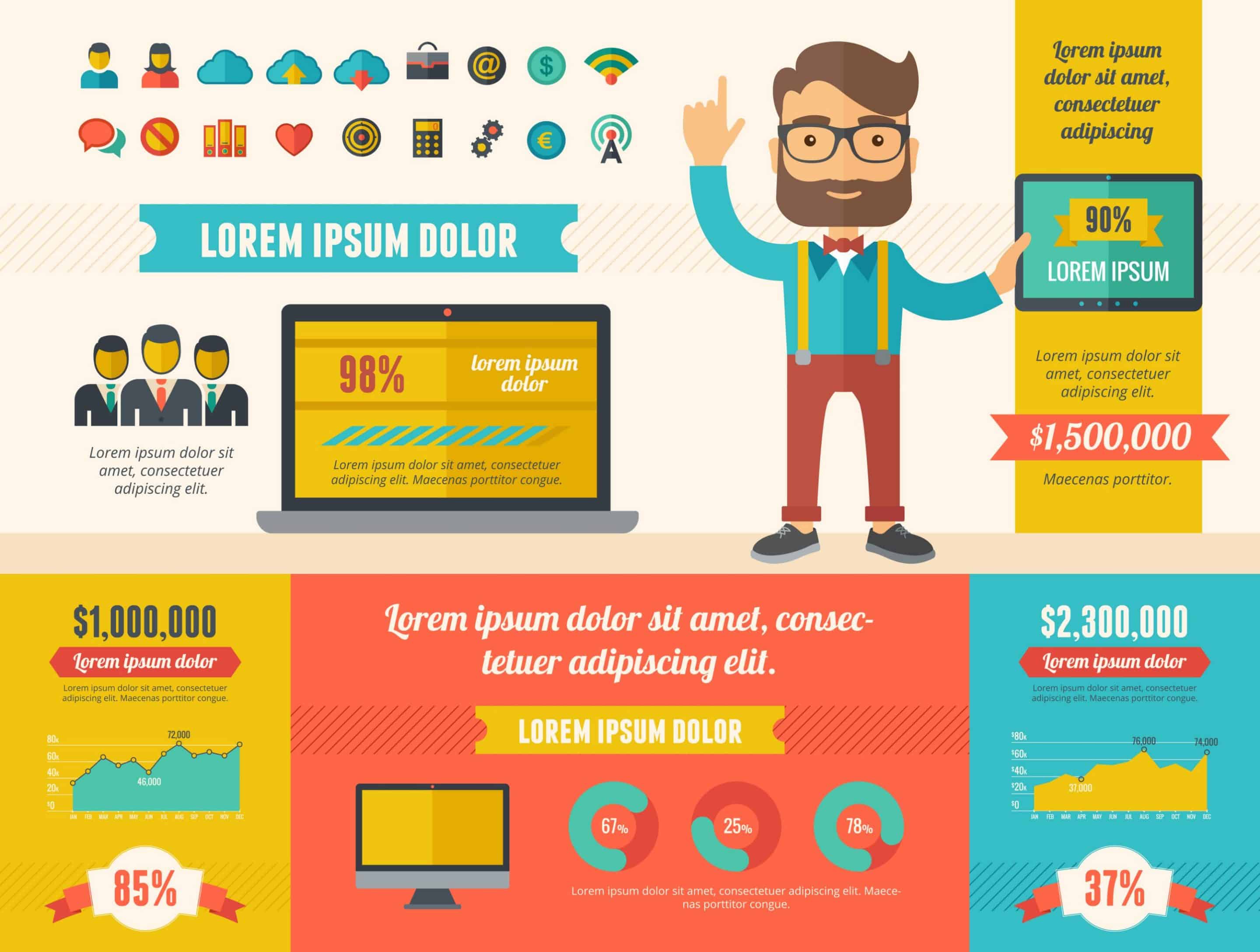
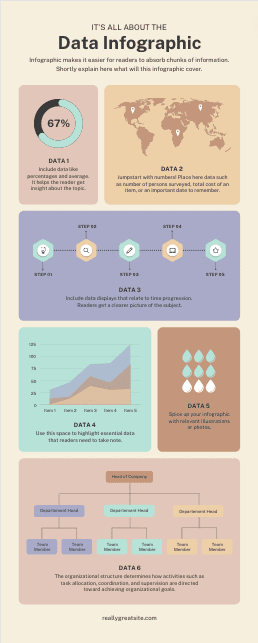
INFOGRAPHICS
Digestible and Sharable Visual Information Summaries.
Why infographics should be part of your content marketing strategy?

Okay, so first of all…
They look great. Infographics can make even the dullest of topics look interesting.
Think about it…
What would you rather read? Ten pages of a text-only research paper or a colorful image summarizing all the key findings? Exactly. Then, you need an Infographics Designer.
If your content doesn’t look good, chances are not a lot of people are going to want to engage with it. Using infographics instead can help you get your point across without putting your audience to sleep.
They’re easy to digest. Infographics are more than just pretty pictures. They can also help explain complex information by breaking it down into visual bits and pieces.
They’re shareable. People love to share interesting visual content on social media. Take a look at your own Facebook or LinkedIn feeds if you don’t believe me.
If you want your content to get shared and even go viral, infographics are one of the best ways to make that happen. Add your website link along with your infographics to drive more traffic!
They’re good for SEO. Text-based posts aren’t the only way to rank for target keywords. Infographics can help you show up in Google’s image results.
Plus, infographics are a great link building tool. If your infographic gets a lot of backlinks and shares, search engines will pick that up and help it rank higher for relevant keywords.
They help increase brand awareness. You can add your logo, website and company information to your infographics to increase brand awareness on multiple platforms.
8 Types of Infographics
List Infographics
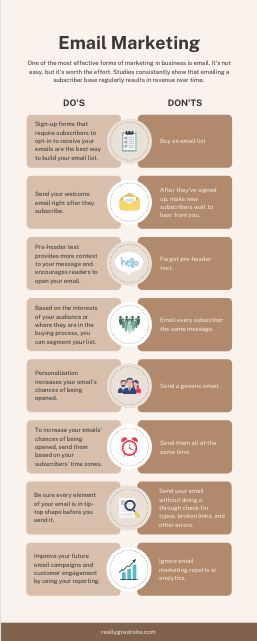
A list infographic is an informational graphic that uses a written list to get a message across. It’s full of written copy, but it’s also highly visual. Like other kinds of graphics, it’s eye-catching and typically includes a wide range of design elements.
When should you use a list infographic?
A list infographic comes in handy when you want to list several items. It allows you to convey information using data-rich text without compromising on visuals.
When creating a list blog post, include this type of infographic alongside your main points to increase both readability and shareability. This helps break up large blocks of text and add visual texture to your article. It also generates engagement on social media sites like Facebook or Pinterest.
Contextualizing information with visuals makes it easier to read and makes the statistics more memorable. For a powerful list infographic, use icons to represent your various items. You can also try formatting each point in a staggered zigzag to break up the monotony of the list.
How-to Infographics
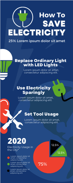
A how-to infographic explains how to do something, like how to solve a problem or perform a task.
It’s a fantastic alternative to long pieces of text that describe a step-by-process, like proper hand washing or workplace setup, without bombarding the viewer with information. Compared to a paragraph or written list, the how-to infographic makes each step of the process easier to absorb.
When should you use a how-to infographic?
A how-to infographic helps people digest concepts that may seem dry when presented in the form of text. This helps people process detailed instructions or tips, particularly when they are technical, complex or require visualization.
When it comes to marketing your brand, you can use how-to infographics to address common pain points among your target audience—and then offer your product as the solution.
Try accompanying each of your tips with a visual illustration. Then, add numbered labels to various parts of the illustration to guide readers through the steps and help them conceptualize each point.
Comparison Infographics
A comparison infographic is a visual way to compare and contrast different options. By presenting two or more alternatives side-by-side, this type of infographic helps readers understand the distinction between various concepts and, in many cases, choose which option is best for them.
When should you use a comparison infographic?
In marketing, comparison infographics are used to showcase how your product or service has an advantage over that of your competitors. They typically make use of a chart or table format, with icons or illustrations to help readers visualize the similarities and differences. This type of infographic is particularly powerful when placed within a blog post.
If you’re writing content that compares and contrasts different options, use this type of infographic to supplement your analysis. By highlighting your main points, it will make your article easier to scan and will help readers make an informed decision about their approach.
Flowchart infographics
A flowchart infographic is a graphical representation of an information stream, such as a sequence of different steps or actions.
When should you use a flowchart infographic?
A flowchart can be used by marketing professionals of any industry. It helps walk people through a process, and often asks people yes or no questions and then points them to the next step based on their responses.
This type of infographic boosts engagement while giving users a very clear idea of what the process is about. Because it guides people individually through the various steps, it feels more personal and tends to resonate closely with potential customers. You can even use it to steer potential customers toward choosing your product as the solution to their needs.
Flowchart infographics are also useful for internal purposes, especially when onboarding new employees, explaining how to use company tools, or troubleshooting common problems. When used internally by business, they help teams understand vital concepts, such as how to create marketing campaigns or how to follow up with leads.
Statistical Infographics
A list infographic is an informational graphic that uses a written list to get a message across. It’s full of written copy, but it’s also highly visual. Like other kinds of graphics, it’s eye-catching and typically includes a wide range of design elements.
When should you use a list infographic?
A list infographic comes in handy when you want to list several items. It allows you to convey information using data-rich text without compromising on visuals.
When creating a list blog post, include this type of infographic alongside your main points to increase both readability and shareability. This helps break up large blocks of text and add visual texture to your article. It also generates engagement on social media sites like Facebook or Pinterest.
Contextualizing information with visuals makes it easier to read and makes the statistics more memorable. For a powerful list infographic, use icons to represent your various items. You can also try formatting each point in a staggered zigzag to break up the monotony of the list.
Timeline Infographics
The timeline infographic is not only useful and informative, but it’s also visually appealing.
What is a timeline infographic?
A timeline infographic is an infographic that displays events in chronological order.
When should you use a timeline infographic?
Timeline infographics are one of the most diverse in terms of their use. Typically, marketing professionals will use them to:
-
Show the historical development of a person or item
-
Explain the evolution of a product or trend within their niche
-
Demonstrate how a particular practice has evolved over time
When creating this type of infographic, be sure to use icons and illustrations along the full length of the timeline to represent each point. This transforms historical information into a fun and easily digestible format, and makes it easier for readers to remember all the facts.
Map/Location infographics
A location infographic, as you may have guessed already, is a graphic that visually communicates information in relation to a geographic area. It’s usually presented in the form of a map, whether it’s a world map or a map depicting a specific country or region.
When should you use a map or location infographic?
Map infographics can be used for a variety of purposes. People tend to use them when they want to communicate demographic data or other location-specific information. As a marketing professional or small business owner, you can use a map infographic to highlight insights about your user base or target audience.
If you’re aiming to share statistics about different countries, use a map infographic. This invites viewers to look closely at the numbers, and it also helps them compare and contrast the data between various places around the world.
Process Description Infographics
A process description infographic visually describes the main elements, actions, and steps of a process.
When should you use a process description infographic?
You might consider using a process description infographic to communicate technical information or a complex series of actions. It can also help you emphasize the fundamentals of using your product, thereby offering value to your customers.
It’s useful because it highlights the most important steps, and simplifies complex ideas by breaking them down and then grouping them by category. Not only does this teach people how to use your product, but it also markets your product’s features to generate interest in your brand.


